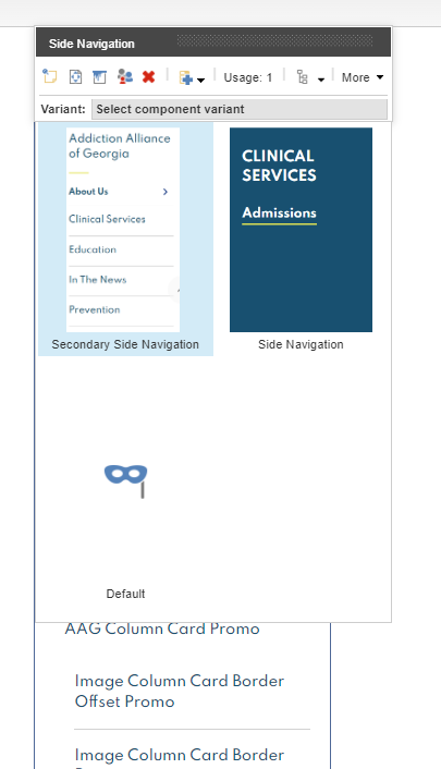
- The component resides inside the EH Navigation tab in the Toolbox by the name Side Navigation.
- This component does not have a data-source item, when added to a page, it generates a navigation menu based on the item hierarchy.
- There are two rendering variants - Secondary Side Navigation and Side Navigation. The thumbnail of the variant displays how the component will look when that variant is selected.
- The Navigation menu considers both Sitecore Page items(based on various page templates) and Redirect items.
- Redirects can be used to add external links in the Side Navigation.
- Redirects Item Fields used in Side Navigation :
- Link caption in navigation: single line text field to add caption which will be displayed in the Navigation Menu.
- Redirection URL: the link added in this field will be linked to the Navigation Menu text for this item.
- Sitecore Page Item Fields used in Side Navigation :
- Link caption in navigation: single line text field to add caption which will be displayed in the Navigation Menu.
- Sitecore Page URL(will be automatically generated) will be linked to the Navigation Menu text for this item.
- Rendering Parameters(in Navigation Settings section) :
- Start Page – if you want your site to open on a different page than the home page, select that page here.
- Top Navigation Level – click the level (counted from the root) that the navigation should start at.
- Bottom Navigation Level – click the level (counted from the root) that the navigation should end at.
- Navigation Filter – click the navigation filter from the drop-down list, and select Sidebar Navigation.
- To hide a page from Navigation Menu :
- Go to the page item and look for Check to hide in the navigation filters field in the Navigation section.
- Select the Sidebar Navigation checkbox from the list.
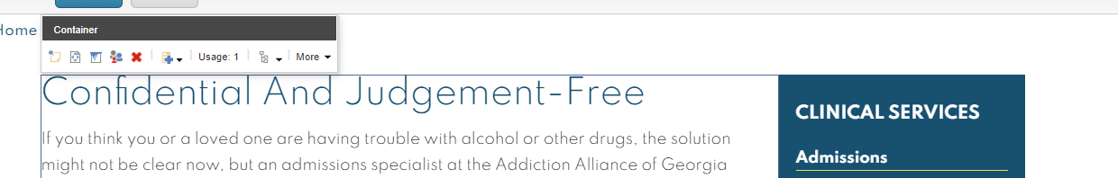
- CAs should note that whenever a Side Rail component is to be added to a page, it should be added inside a Container component, and that Container component should have the Sidebar paint bucket setting selected.
- An example of the component is displayed here HERE

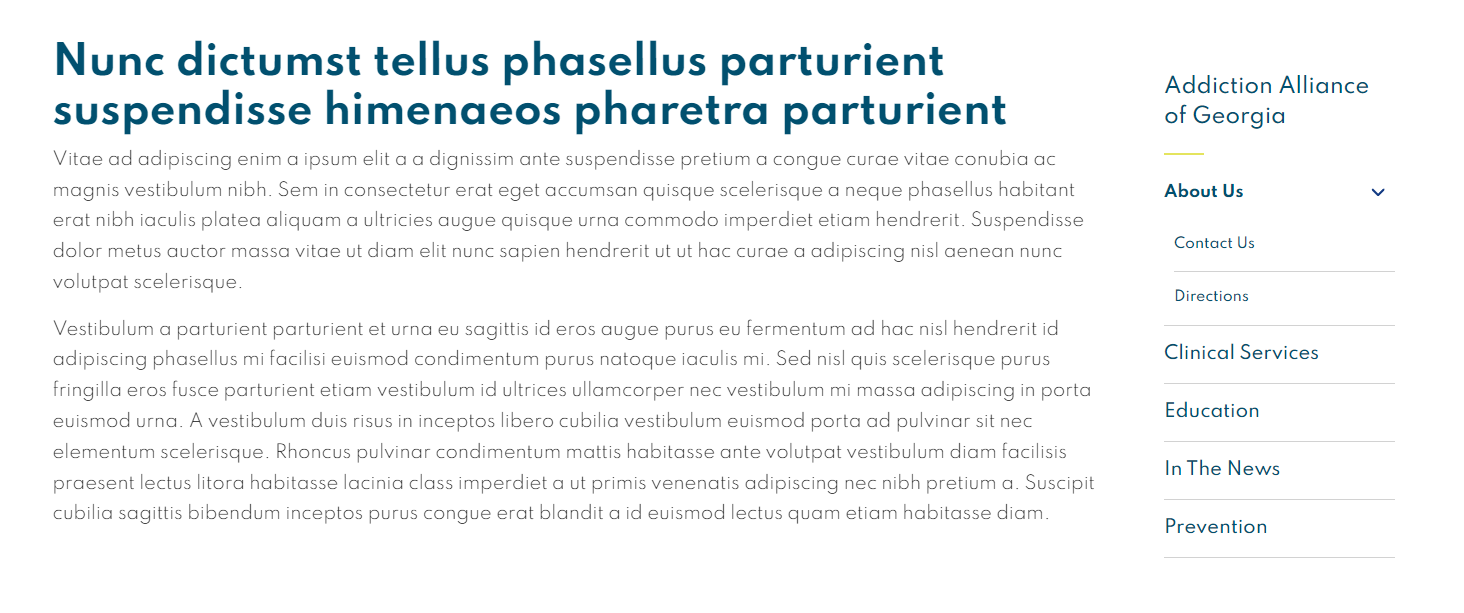
AAG Side Rail
Developer Notes
Content Author Notes
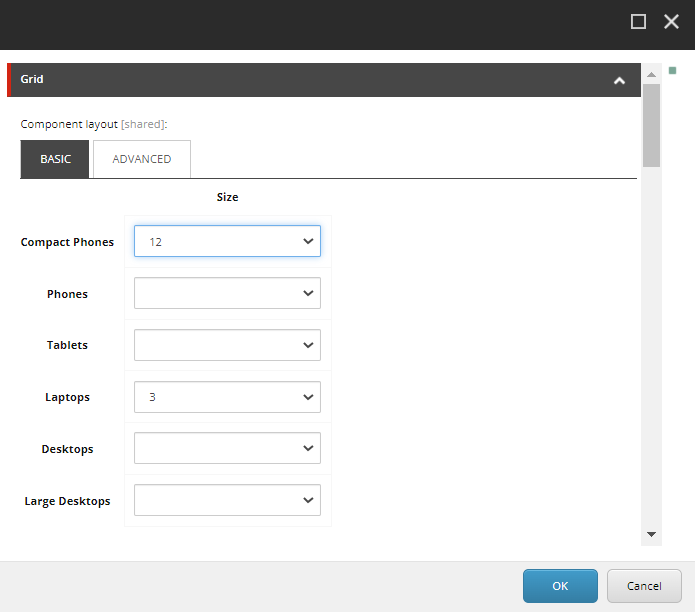
1. Open up EE, authors will need to create a two column page. Authors will need to update the grid settings on with the container that is already on the page
2. Open up paint bucket settings and set to "9" on laptops
3. Once the page has updated, you will want to add a container after the first container. Click "Add Component" and click "Add Here" after the container.
4. Select "Container" rendering located under "Page Structure"

5. No data source is needed. You will need to open up paint bucket settings to update the grid settings to "3" for the second container.
6. Once updated, you will be able to click the second container and select "Add Here"

7. Select the "Side Navigation" rendering under EH Navigation

8. Recommended: Save Changes.
9. Click Side Rail and change the variant to "Side Navigation"
10. Open up paint bucket settings to determine the start page. Authors will also be able to determine levels that are included in the side navigation within paint bucket settings.

11. Save and publish changes.
Requirements
AAG Side Rail:
- The AAG Side Rail will be displayed to the right of the page content below the space of breadcrumb, right of content
We are mirroring Emory's right rail functionality and using AAG Theme. - The Side Rail will be populated based on site structure and configuration.
- The interior navigation will be dynamically generated to show all pages and external links that are in the current section
of the CMS. - There will be a home page link under the section title.
- The root page is not clickable. Everything else under the root/start page should be clickable.
- If an item has a carat it should be clickable.
- The Side Rail will support up to tier 4 navigation. All lower tiers should be created within the content page.
- A carat will be shown to the right of the menu item, if the folder level goes down another tier. If there is no other
tier below, the carat will not be shown. - Home page should be dictated by start page in navigation settings.
- Navigation will be dynamically generated in relation to the site section home page.
- The order at which the links appear will be determined by the order they are presented in the tree.
- Navigation should also verify if any page is excluded from navigation in navigable data pas part of the base page.
The CA should be able to click a box to exclude. - Upon load of page the nav should remain closed until the user makes a selection.
- For styling use AAG Theme Colors AAG Brand Guidelines
Secondary Variant Styling:
- Follow Emory Design using the below colors
- Eyebrow AAG Yellow 2px solid #E4E45E
- Font for titles and Links AAG green #01506F upon hover of links it should be AAG Orange #C75300. (Similar to header nav)
- On Mobile:" In This Section" Font should be AAG Green #01506F on white background
Mobile:
- See requirements above
- Side rail collapses into accordion
- "In This Section" will come from AAG dictionary.
- Children will be displayed in a dropdown.