- The component resides inside the EH Navigation tab in the Toolbox by the name Icon Link List.
- The Icon Link List component is built using a parent-child model where the parent has the heading of the Icon Link List and child(ren) are the list of icon links.
-
Applicable fields of Icon Link List parent item:
- Title: Single link text field to add a heading.
-
Applicable fields of Icon Link List child item:
- Link: A link field to add link properties of the icon link
- SVG Icon: Image field to set the image to be displayed.
- Icon Link List has one variant - default.
- The component will fill the whole width of the parent, therefore it's best to be added under the Section Container component.
- The Icon Link List has a white background by default, it's recommended to set the component under the Section Container component with a darker background color.
- An example of the component is shown HERE

Icon Link List
Resources and Information
Developer Notes
Content Author Notes
1. Open up EE and click the "Add Component" icon
2. Select placement and click "Add Here"
3. Select rendering "AAG Icon Link List" under EH Navigation folder
4. Once component is uploaded, click Title placeholder text to add title to icon link list
5. Open up paint bucket settings to update the title to the correct heading style and/or apply eyebrow. In most cases, heading should either be H2/H3.
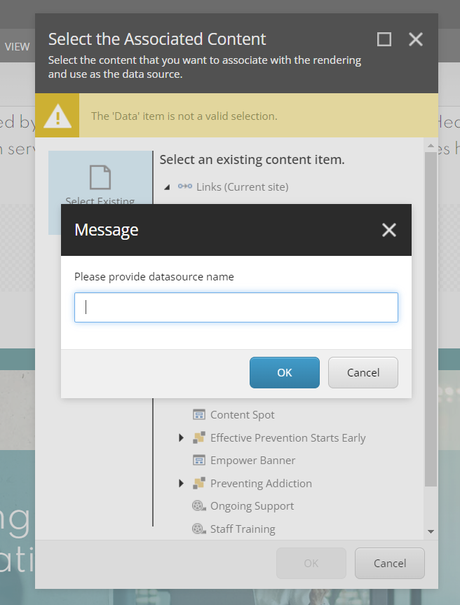
6. To add icon, select placeholder image. Image must be a SVG format. Authors can also add a link to the SVG (recommended)
7. To add link, click placeholder link text. Click the link icon with a pencil. You will be able to manage the link
Link description will be the link text
8. Save and publish changes
Requirements
AAG Icon Link List:
- The AAG Icon Link list is a variant of the Icon link list. It can be used on any page.
- The Icon Link list should include the following elements:
- Title (H2)
- Icon/Image
- Subtitle (link)
- Icon and subtitle are both clickable using same link
- The CA should be able to use an internal or external URL.
- External URL's should open in a new tab.
- The user should see a popup box indicating page will open in a new window (Ie; The Family Program)
- Make sure the alt text attribute is present.
- The window popup text is content authorable.
- Carat expands upon hover. (note: text does not change color)
- Icons are shown left to right and are in two columns displaying 3 horizontally.
- Use SVGS for icons via Font Awesome
- For styling please see live site
- This component must follow accessibility standards for alt text, and keyboard navigation.
Mobile:
- See requirements above.
- When minimized in width, the columns will stack left to right into a single column.