- Component resides inside EH Composites tab in the Toolbox by the name EH Accordion.
- The accordion component is built using a parent-child model where the parent has the heading and body of the Accordion and child(ren) are the list of collapsible items.
- Applicable fields of Accordion parent item:
- Heading : RTE field to add heading.
- Body : RTE field to body.
- Applicable fields of Accordion child item:
- Heading : RTE field to add heading of the accordion child item, displayed when the item is collapsed
- Content : RTE field to add body/description of the accordion child item, displayed when the item is expanded.
- Rendering Parameters(in Accordion Control section) :
- CanToggle - select to allow toggling of sections. Selected, by default.
- As accordions have full-width background, they are to be placed directly inside main placeholder. Please do not add it to any section-container.
- Accordion has a paint-bucket class-"Small Width Accordion", which reduces the spacing around component. This paint-bucket is primarily used on "Admissions" page, where accordion doesn't span full-width of screen
- In order to add Accent variation on component, one can select "Accent" from paint-bucket on Accordion.
- An example of the component is shown HERE

AAG Accordion
Specialized Treatment programs
-
Justine Welsh, MD
 Justine Welsh, MD is a Child/Adolescent and Addiction Psychiatrist, Director of the Emory Healthcare Addiction Services, and Medical Director of the Addiction Alliance of Georgia. Dr. Welsh completed her training in general psychiatry at Emory University Medical School. She subsequently completed her child and adolescent psychiatry fellowship at Cambridge Health Alliance, a Harvard Medical School affiliate, and an addiction psychiatry fellowship through Massachusetts General Hospital, McLean Hospital, and Brigham and Women’s Hospital.
Dr. Welsh’s area of clinical focus and research is in the treatment and prevention of adolescent substance use disorders, as well as opioid use in young adults. She has been the recipient of grant funding from the American Academy of Child and Adolescent Psychiatry, the Georgia Clinical and Translational Science Awards Program, and the National Institute on Drug Abuse.
-
During your follow-up assessment, the licensed counselor will help you decide whether residential or outpatient treatment is needed and what programs will best meet your needs. With your permission and signed consent, they might contact other medical and mental health professionals you've worked with to understand the scope of your needs. They may also call family members who can provide context and background information about your situation.* *We never speak with anyone you have not expressly permitted us to contact.
Developer Notes
Content Author Notes
1. Open up EE and click the "Add Component" icon at the top
2. Click "Add Here" where you would like the Accordion to be placed. Select EH Accordion under EH Composites

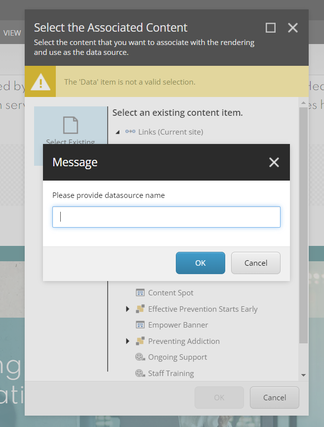
3. Create a data source
4. The accordion will have two items automatically added underneath the accordion. To edit the main heading, click the placeholder text and update the field.

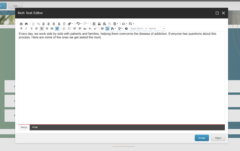
5. Author will be able to update body text if needed. You can manage this in EE or click the pencil icon to open up the Rich Text Editor.
To manage the individual items:
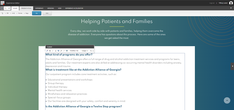
6. Click the heading to update the item heading. It will default to an H3 heading style.

7. You can open up the accordion item by click the white space outside of the placeholder text. Accordion should extend and you will see placeholder text for the body. This is managed by an RTE field.
8. To add items, ensure design mode is enable in the view tab. Click an accordion item and you will see a dialog box populate with multiple icons including an addition icon, delete, move icons. Once you click the add icon, a pop up window will populate and you will be able to create the data source.

Paint Bucket Settings:
Paint Bucket settings control background color, width and accent variant.
1. To open up paint bucket settings, ensure the design view is enabled in the view tab. Click the accordion component.
2. Check boxes that are applicable

3. Save and publish changes.
Requirements
AAG Accordion:
- The accordion will be used primarily on the interior pages and allows you to stack
a list of collapsible sections. - The Accordion should contain the following elements:
- Heading RTE (wrap heading in H2)
- Body (RTE)
- Accordion Items:
- RTE (ability to add images) see AAG RTE
- The background is fixed not editable by CA.
- The CA should be able add unlimited list items.
- Can toggle should be enabled by default.
- The image and grey background will be added via RTE snippet. A separate
component is not needed (Meet the Team) - Upon page load the Accordion should be in a closed state.
- The accordion icon should change to an open/close state. +/-
- Upon hover, accordion item changes to AAG orange.
- When user opens one accordion item the other items remained closed. Opening one closes the other.
- Styling followed live site and AAG Brand Guidelines
- This component must follow accessibility standards for alt text, and keyboard navigation.
Mobile:
- Content is stacked.